Hey, y’all! I’m Kimberly from Kimberly Geswein Fonts.
I’ve been making fonts since 2006 and have dabbled in various worlds of graphic design since my college days (that’s a long time ago!) My husband teaches 5th grade in Orlando, Florida and I previously taught high school.
I was having lunch with Deanna (yes, total name dropping, but I am real life friends with the Queen of TpT)

and we were chatting about font usage and I forced her to let me take over here at Mrs. Jump’s Class and share some font tips with all of you! I hope you don’t mind me barging in like this!
Fonts are amazing little creatures when treated with the respect they deserve. They can completely change the feel and personality of a document when used appropriately- or inappropriately. Responsible font usage is fundamental in any design process.
I’ll be introducing you to 3 main design concepts that are important for teachers to keep in mind when creating things for students.
1. Legibility
If the whole point of making teaching products is to teach children, we need to make sure things are neat and easy for kids to read. Why make a struggling reader work harder by giving them text in a font that is difficult for even an adult to decipher?
As a general rule, using a sans serif simple font for the body text is appropriate. This example shows both a serif and a sans serif font. A serif is a little dash or line at the end of the stroke (as highlighted in yellow on the serif example. The most widely used serif font is Times New Roman.
In contrast, a sans serif font does not have any of those little dashes or lines. It is very clean/neat/open and easy to read. Examples include Arial, Century Gothic, and Helvetica.
Some of you might not love this idea of using only a “boring” text font like these for your documents. I understand. But if the student is the target audience, things need to be directed to the student and be as legible as possible for them.
Recommended legible fonts:
KG Part of Me
KG Primary Penmanship
KG Miss Kindergarten
Quicksand
Andika
Print Clearly
Century Gothic
Display fonts (or decorative fonts- which is primarily what I make) are meant to be accents. They are like the jewelry of your product or document. You don’t wear jewelry as your shirt or pants, right? Display/decorative fonts are accents that accessorize the basic staples of your font wardrobe.
2. Appropriateness
Some fonts are appropriate for some things. Other fonts are appropriate for other things.
We get in trouble when we mix things up and use inappropriate fonts for the occasion. Keep this in mind when creating. Here are some examples:

We can convey a totally different meaning when we use the appropriate font.

3. Moderation.
A general rule of thumb is to use no more than 3 fonts in one design or page. The reason for this is that it gets extremely overwhelming to have multiple fonts for the eye to process.
On a typical page, this might include:
1 Display Font (decorative font for titles)
1 Subtitle Font (decorative subtitle font)
1 Sans Serif Body Font (this is for all student-read body text)
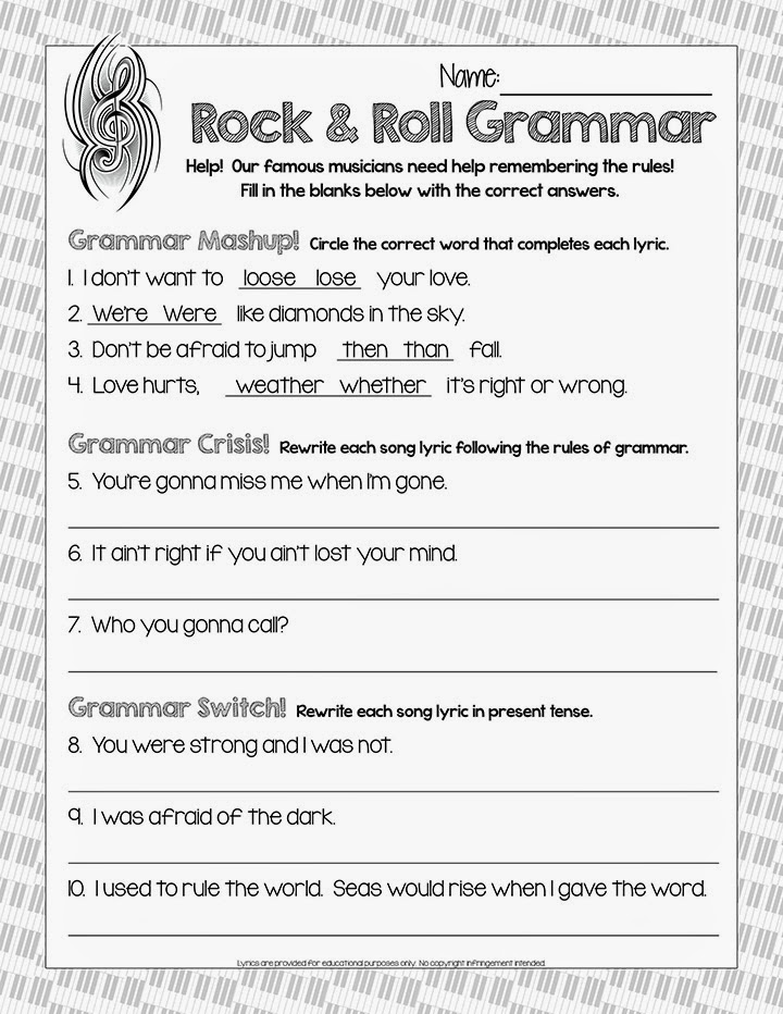
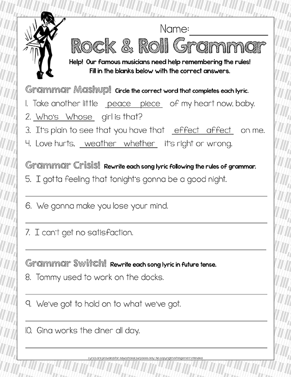
I have 3 example pages from the same unit. This unit is actually a free product in my husband’s store, and if you like it, please grab it here.
The first example is the original page as he created it.
As a third example, I want to show completely crazy irresponsible font usage. This is when you forget your legibility, forget moderation, and forget appropriateness. This page is basically unusable in a classroom- despite being the same content as the above pages.
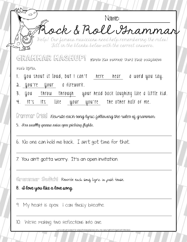
It’s no longer attractive and it looks like a mess with no theme or consistency. It doesn’t look professional.
I hope these tips are helpful! If Deanna invites me back, I hope to share with you about how to pair fonts (i.e. what goes together- and what doesn’t go together!)
***
Finally, just because a font is free to download online doesn’t mean it is free for commercial use. If you are using the fonts in a product you wish to sell on TpT, be sure to check out the terms of use from the font designer. All of mine, for example, require a one-time $5 commercial use fee.